Websites come in all different shapes and sizes. Whether it’s for e-commerce, business, entertainment, or education one thing remains the same — users expect a consistent and flawless experience.
At PLUS QA, our teams have the privilege of testing all kinds of websites on both desktop and mobile devices. It is through this experience that they can identify a lot of the common issues that appear when testing different pages, features, and functionalities. Here are the most common bugs we find on website projects.
Formatting Bugs

The visual presentation of your website will be one of the first things a user will notice when they land on your home page and begin to perceive the content on display. A visual experience with noticeable errors creates the impression of an incomplete or unpolished website. Some examples of these errors include missing or misaligned text and images, overlapping content, low-resolution media, or even the absence of a page favicon.
A website must also be responsive, meaning it should be able to dynamically adjust its content and layout to best suit the device the user is viewing it on. If a website is not correctly responsive, the user may not only experience visual defects like images not scaling relative to the device screen size but also functional defects such as being unable to interact with navigational elements like a site menu or the footer navigation.
Formatting bugs are very common on website projects we test and can have the strongest impact on the user experience when left unchecked.
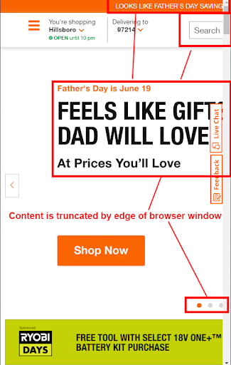
Here is an example of a bug we would file for a formatting error. In this case, the tester identified that when they resized their browser window to a mobile screen width, the content visible in the hero carousel and top navigation would be truncated by the edge of the browser window. This is likely due to a responsive layout not being in use for this content.

Links / Buttons / Forms
Some of the most frustrating common bugs we discover during testing are ones that involve links. As a user, we expect that when we click a link it will open a new tab in our browser and direct us to the anticipated location. Unfortunately, this is not always the case and more often than not we will identify bugs where a link can either not be clicked, does not redirect correctly, or will open on the same browser tab instead of creating a new one. For websites in which there are a significant number of sub-pages or navigation layers, this becomes especially frustrating and a poor user experience. The same can be said for buttons that may either be functionally identical to a link or have a unique functionality such as revealing additional content to the user when clicked.

If the website is a business or an e-commerce site, there will likely be some kind of form present for either submitting a contact inquiry or completing transactions. Whenever we test the functionality of a form, we find issues on the front-end such as input fields that do not accept data entry as well as back-end issues such as form submissions that are either partially or entirely not received by the end-user.
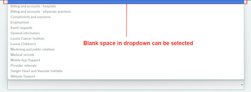
Here is an example of a healthcare website with a contact form where the user is able to select a dropdown to view a list of options. In this case, the tester identified an issue where a blank space can be selected as a dropdown option for a required field. This would be unexpected since a user should not be able to submit missing information.
Browser Compatibility

As we’ve reported in our annual browser usage statistics blog, the user base of different browsers is diverse which means that it should be expected that a website will be viewed on more than just a single type of browser. When we test websites, we not only validate them against all of the most popular browsers such as Chrome, Safari, Firefox, and Microsoft Edge but we also check different versions of the same browser as oftentimes, unique issues will be found that are specific to a single version.
Different browsers will require that vendor-specific functions be used in the CSS code for the website in order to be rendered correctly by the browser. These come in the form of short syntax prefixes such as -moz (for Mozilla Firefox) or -webkit (for Google Chrome.) When these are omitted or are implemented incorrectly, a web page might have visual defects that are only reproducible on a single browser type but might have otherwise been missed if the testing scope was limited.

Testing across multiple browsers on both desktop and mobile to avoid common bugs will help guarantee that your website is a positive experience no matter how your users choose to access it.
Accessibility
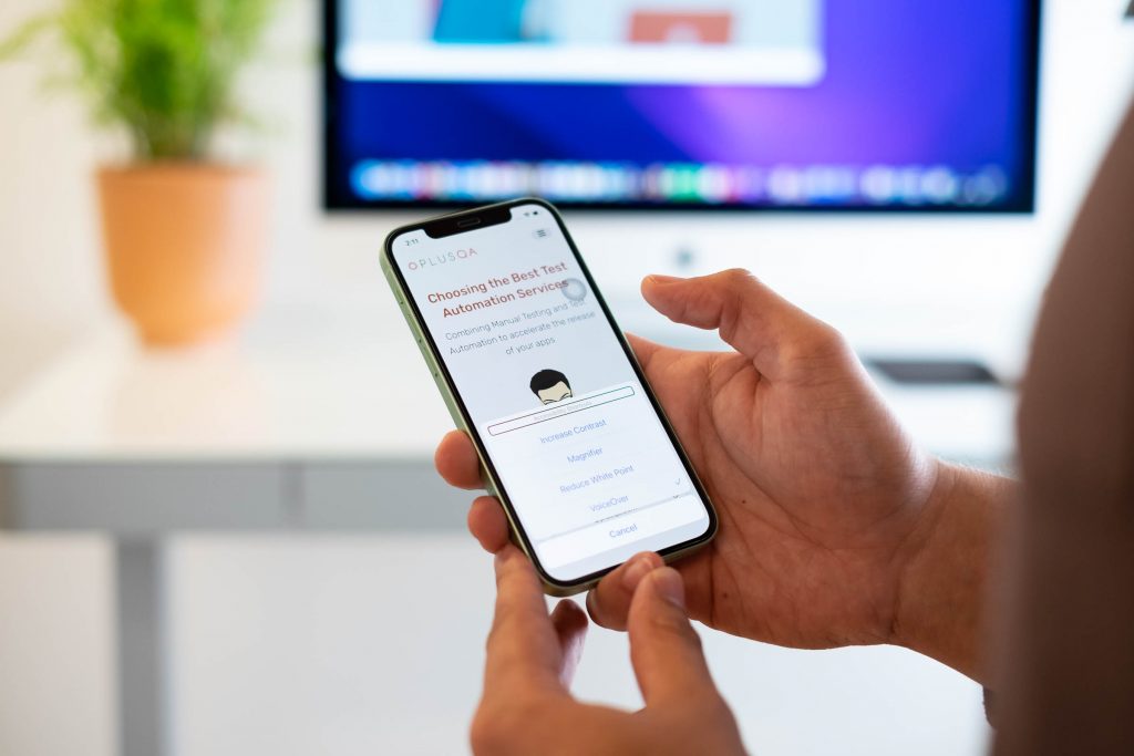
We prioritize accessibility when it comes to testing both app and website projects and our accessibility testing team has been able to identify a lot of common issues that can have a significant impact on the experience of a user with a visual or physical disability. As part of our testing, we will use a screen reader to navigate through the website and often will file bugs that impact that experience. This includes the absence of alt-text for images, a lack of page landmarks (specifically in the main navigation) as well as buttons that read simply as “button” and do not have a unique identifier, which makes the website difficult to navigate and understand.

One common misconception about accessibility testing is that it only evaluates usability for a specific subset of people when in reality, accessibility affects us all. By designing a website or application with accessibility in mind, the user experience will improve for non-disabled users too. Some examples of common bugs we file that affect the experience for all users include text that may not contrast well on top of an image, user interfaces that can’t be controlled by a keyboard, or media that does not appear long enough for a user to be able to read and interact with it.
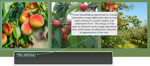
Here is an example of an accessibility issue that a tester might file a bug for on a website for a farm. In this case, the photos in the image carousel are missing descriptive alt-text information that would help a screen reader user to better understand the image content. The tester also identified that due to the absence of descriptive alt-text, the screen reader is reading the file name of the image instead.

Conclusion
Are you planning on launching a new website soon? Being mindful of some of these common bugs may help you better anticipate where issues will appear but for complete peace of mind, consider hiring a testing partner. PLUS QA offers robust on-shore functionality, compatibility, and accessibility testing services. We only test using real mobile and desktop devices from our in-house device lab so that we can best simulate the experience of real users and verify that your website is ready for primetime. Click the button below to get in touch with us today.

